

Building a pricing page for tiered plans is straightforward. However, building one that handles usage limits, credits, add-ons, and real-time cost calculations is a different problem. We looked at 25 SaaS pricing page examples to see how other teams solved it.
How top SaaS companies structure their pricing pages
Great SaaS pricing pages use clean comparison layouts with taglines or personas that help buyers spot their plan immediately. For usage-based pricing, interactive calculators show real costs upfront, so there’s no guessing and no surprises. FAQs are grouped by topic, and trust signals work in sequence: customer logos build credibility early, ROI stats close the deal later.
The actual infrastructure you need includes metering systems that track usage in real time, entitlement layers that instantly grant or revoke features, and product catalogs that let you test new models without deploying code.
25 SaaS pricing page examples and what makes them work
1. Figma
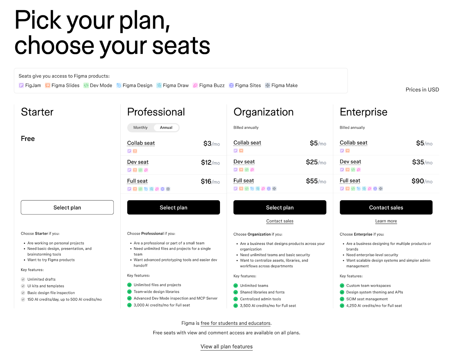
Let's start with a tool most product teams already know.
Figma's pricing page has to work for solo designers and 500-person product teams. Figma’s solution is seat-based pricing that charges differently based on role. Collab seats, Dev seats, and Full seats each have their own price within every tier.
If your developer just needs to inspect designs, they're not paying the same rate as someone building in the file. That kind of flexibility requires pricing infrastructure that can handle multiple seat types across multiple tiers without breaking.
The “Choose this plan if you …” sections below each tier also help. Instead of decoding feature lists, visitors see directly who each plan is for.
What makes it work:
- Role-based seat pricing that matches how teams actually operate
- Clear indicators showing which Figma products each seat unlocks
- Guidance copy that helps visitors self-select the right plan
2. Airtable
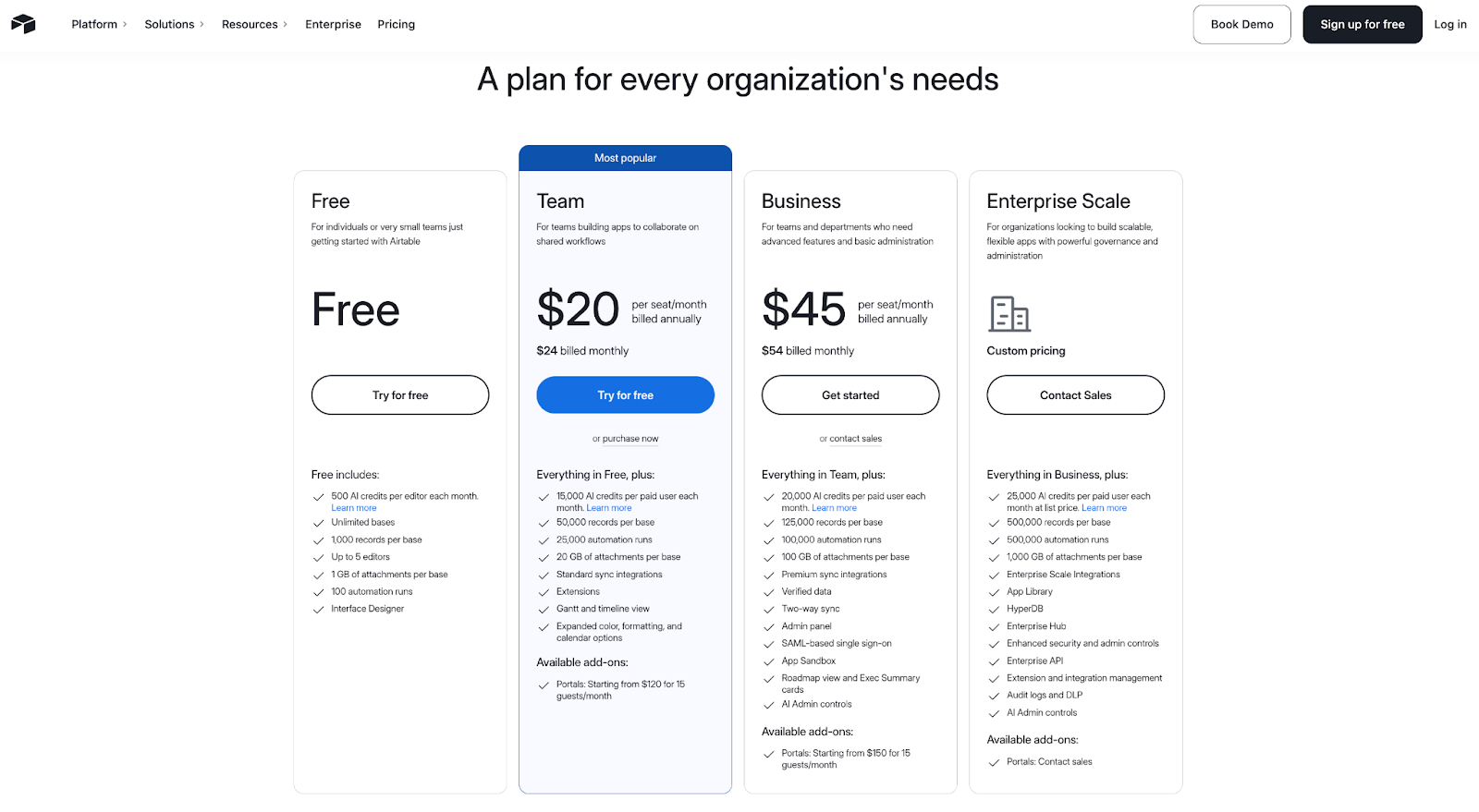
Individuals tracking personal projects. Enterprise teams running complex operations. Airtable's pricing page has to work for both.
Four tiers span Free to Enterprise Scale, with a “Most popular” badge on the Team plan nudging visitors toward the most common choice. Features are grouped into categories like Data and Sync, AI, Project Management, Automations, and Security. Buyers can skip to what matters and ignore the rest.
Below the tier cards, logos from AWS, Walmart, HBO, TIME, and BlackRock do the talking. No case studies needed. If those companies trust Airtable, most buyers will too.
What makes it work:
- Clear tier structure with a highlighted recommended option
- Extensive feature comparison organized by category
- Strong enterprise social proof is positioned prominently
3. LaunchDarkly
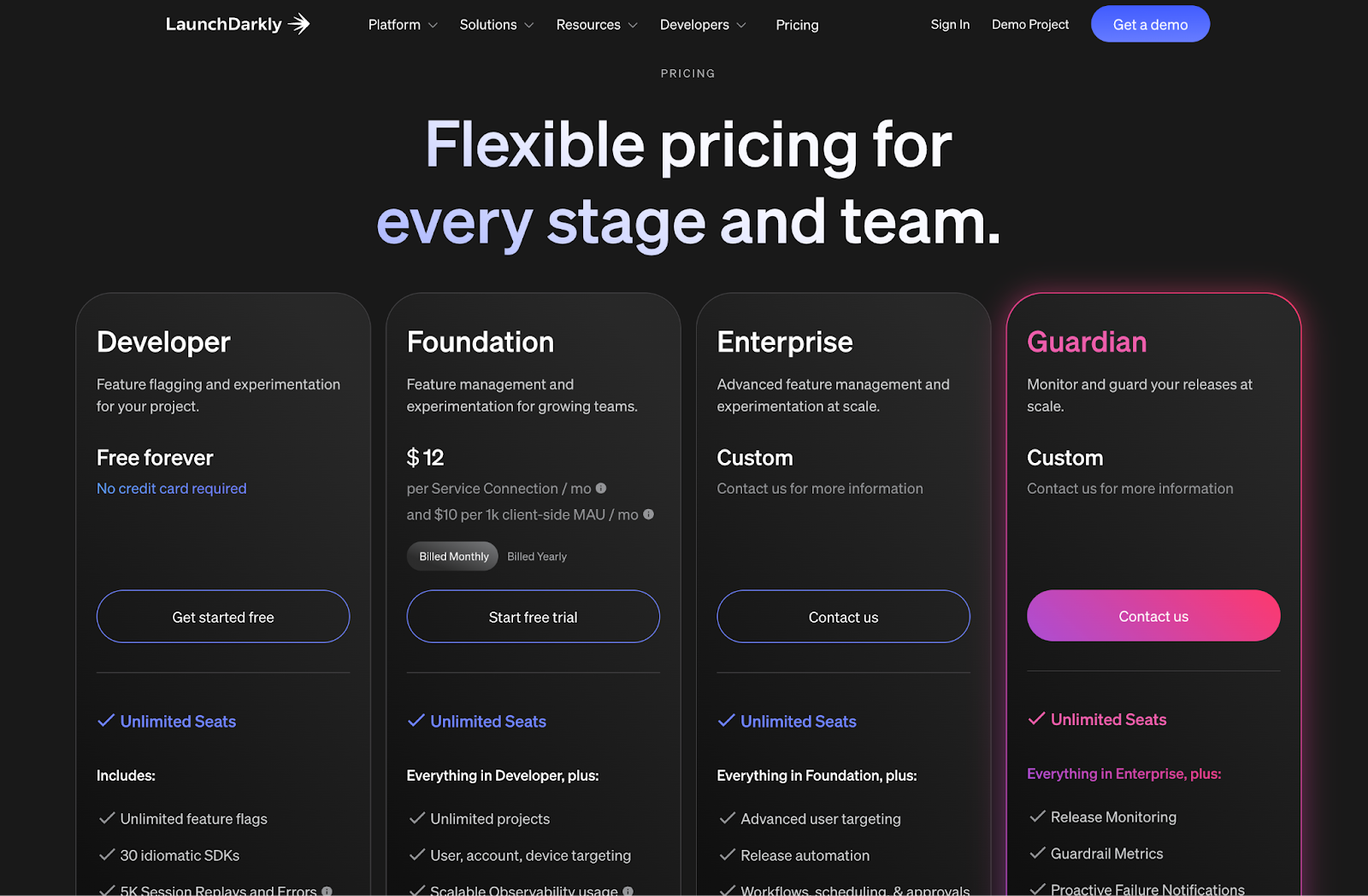
LaunchDarkly’s pricing page balances flexibility with clarity.
LaunchDarkly builds feature management tools for development teams. The pricing page uses a dark header section that makes the 4-tier cards pop, then transitions to a clean white comparison table below.
This 2-part structure works well. Quick overview up top, detailed specs when you're ready to dig in. A Paramount case study near the bottom anchors the page with a “100X productivity” claim, giving hesitant buyers one final push before they leave.
What makes it work:
- Tier descriptions that help visitors self-identify quickly
- Feature comparison organized into logical categories
- Customer proof with specific metrics rather than generic praise
4. Segment
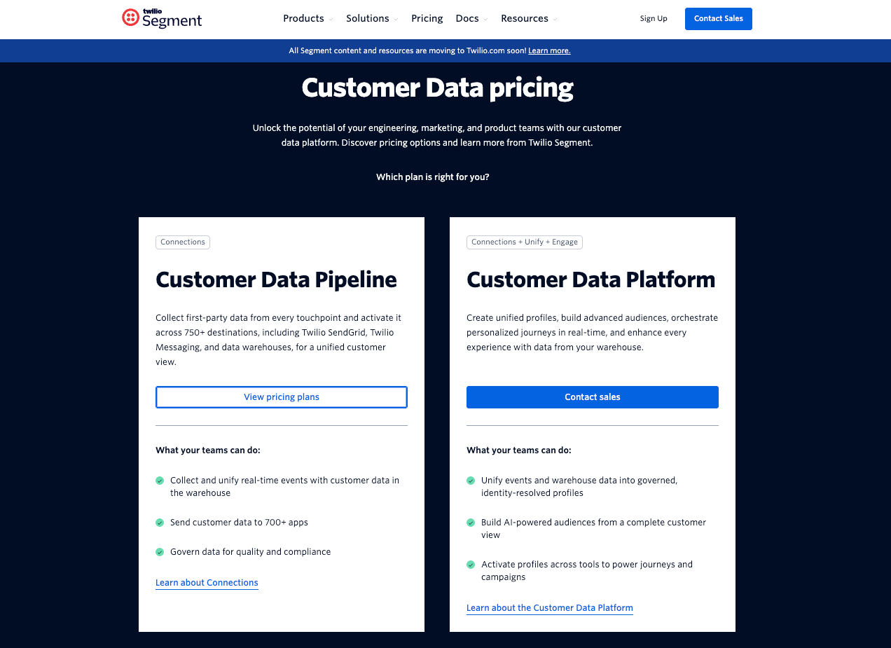
Segment powers customer data pipelines for thousands of companies. Instead of forcing everyone into preset tiers, Segment starts with two foundation options: Customer Data Pipeline and Customer Data Platform.
The real flexibility comes from the add-on modules. Need AI recommendations? Add it. Want audience building? Add that too. You're not locked into a plan that's 60% irrelevant features.
The comparison table reinforces this modular thinking by grouping features around what you're actually trying to accomplish. It's pricing that mirrors how modern data teams buy software: pick your foundation, then build from there.
What makes it work:
- Two primary options that simplify the initial decision
- Modular add-ons that let buyers customize without complexity
- Comparison table that organizes features around what buyers want to accomplish
5. Canva
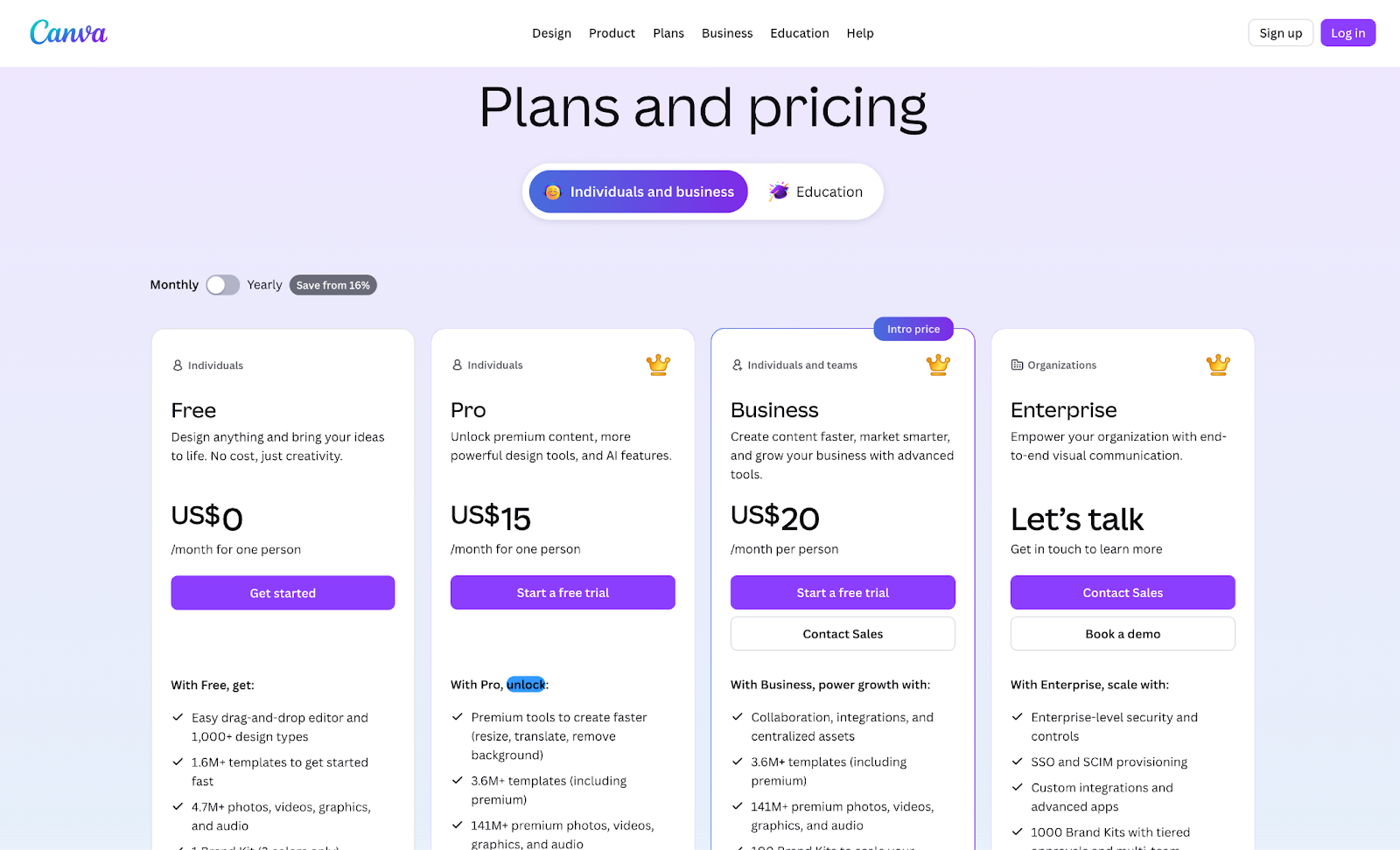
Canva is a design platform that makes graphic design accessible to non-designers. The pricing page has to serve individuals, small teams, and enterprises from a single view. That's a wide range of buyers with very different needs.
Four tiers span Free to Enterprise, each listing 15+ specific features rather than generic bullets. The comparison table uses collapsible sections organized by category, keeping the page scannable despite its depth.
An FAQ section addresses AI usage across plans, which hints at usage tracking or metering logic underneath. There’s also a mid-page “Canva for your business” pitch that targets team buyers who might otherwise hesitate over individual pricing. It’s a smart way to catch two audiences without cluttering the main flow.
What makes it work:
- Feature depth that respects buyers needing specifics
- Collapsible comparison that manages catalog complexity
- Separate business pitch capturing a different buyer persona
6. ChartMogul
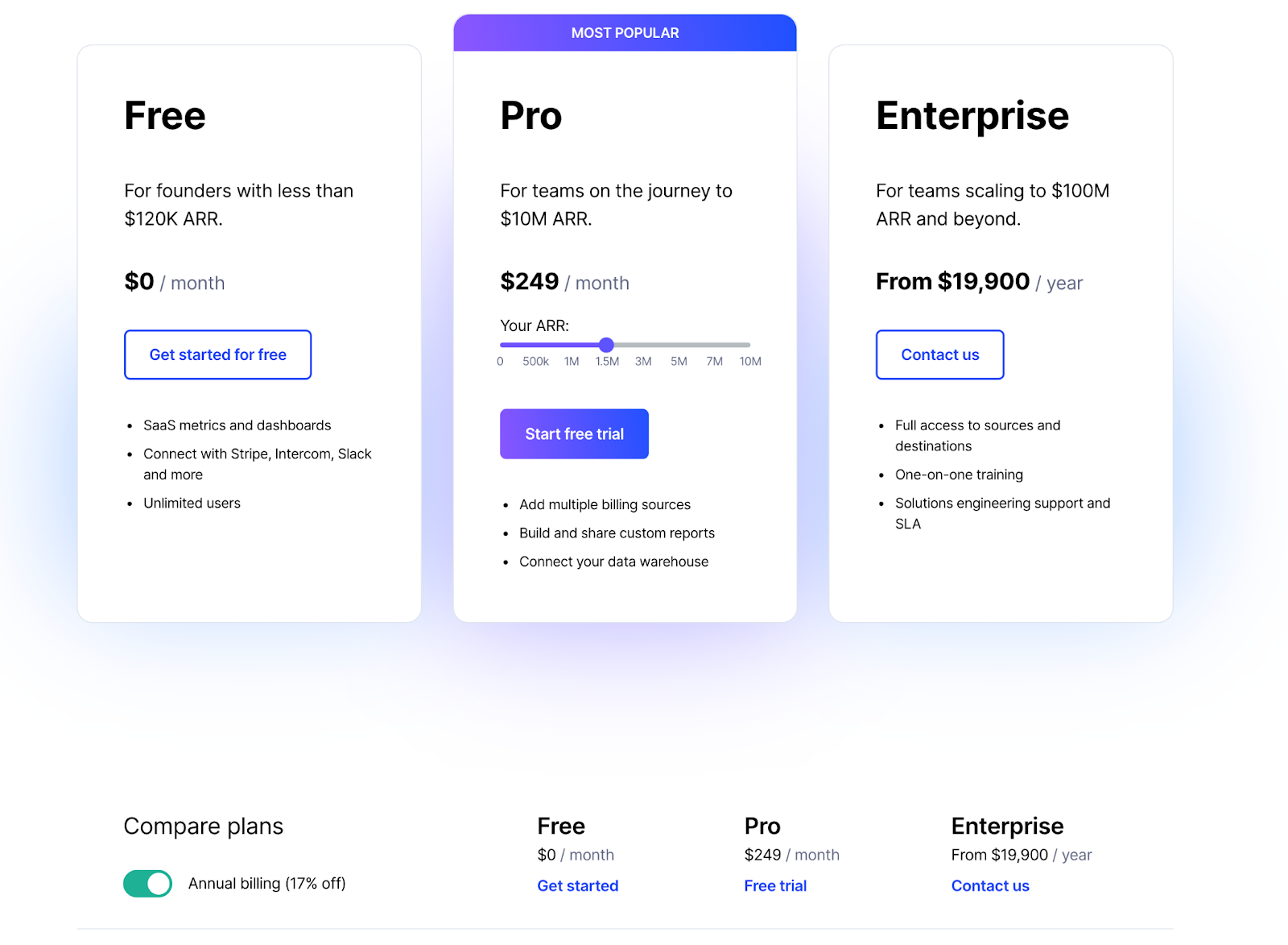
ChartMogul builds analytics for subscription businesses, and its pricing page reads like a growth roadmap. The standout is the ARR slider on the Pro plan. You drag it to your current revenue, and the pricing adjusts to match your scale. No guessing, no back-of-napkin math.
The tier descriptions are smart, too. Free for early-stage founders, Pro for teams building toward scale, Enterprise for those pushing beyond. It's refreshing to see a pricing page that acknowledges companies are at different stages, instead of pretending everyone fits into the same box.
What makes it work:
- Value-based pricing model that aligns incentives with customer success
- Interactive slider that puts buyers in control of the estimate
- Both free tier and free trial are available for different evaluation styles
7. Snyk
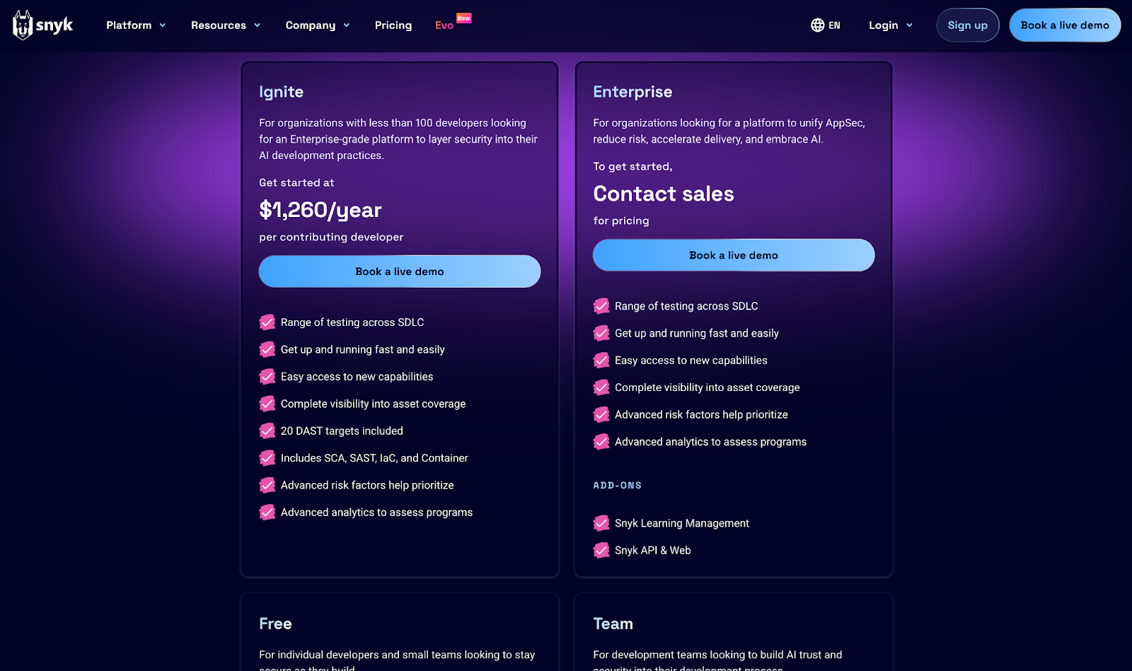
Snyk helps developers find and fix security vulnerabilities in their code. Users range from individual developers working on side projects to enterprise security teams managing thousands of repositories. That's a huge spread, but the pricing page doesn't buckle under the weight.
The feature table specifies exact limits instead of vague capabilities:
- Which SAST languages it supports
- How many test runs per month
- What compliance reports it includes
Security engineers can answer procurement questions without ever talking to sales.
Most dev tools hide these details behind “Contact us.” Snyk takes the opposite approach, treating its pricing page like a public API reference for commercial terms. Everything you need to make a decision is right there on the page.
What makes it work:
- Spec-level detail that bypasses the sales qualification dance
- Engineers can self-qualify before engaging procurement
8. Aircall
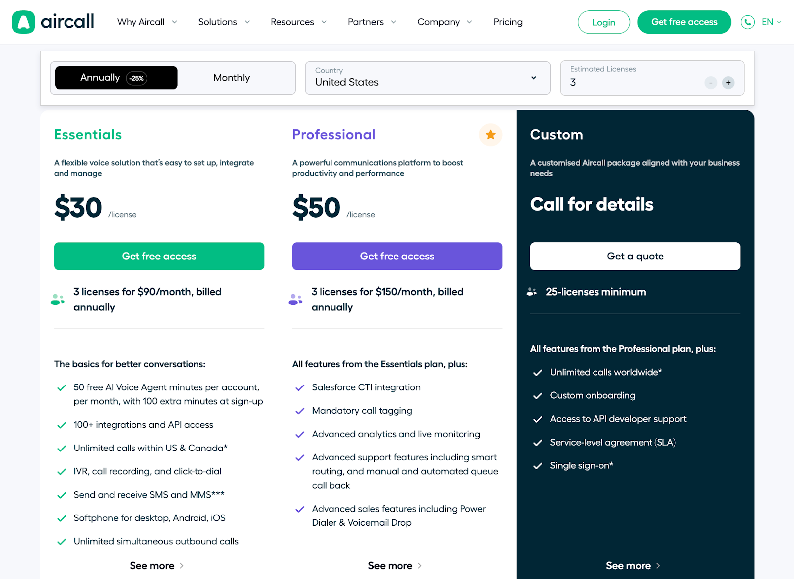
Most phone system vendors make you talk to sales to get real numbers. Aircall lets you build your own quote instead.
Aircall’s pricing depends on location, license count, and payment terms, which includes a lot of variables to juggle. But dropdowns, toggles, and buttons update pricing the moment you make a selection, so you're never left guessing what the final number will be.
For visitors who want a formal estimate, there's a personalized quote tool. Complex pricing doesn’t have to mean a frustrating buying experience, and Aircall proves it.
What makes it work:
- Interactive elements that manage complexity transparently
- Real-time updates that maintain engagement
- Quote generation that captures high-intent leads
9. Stripe
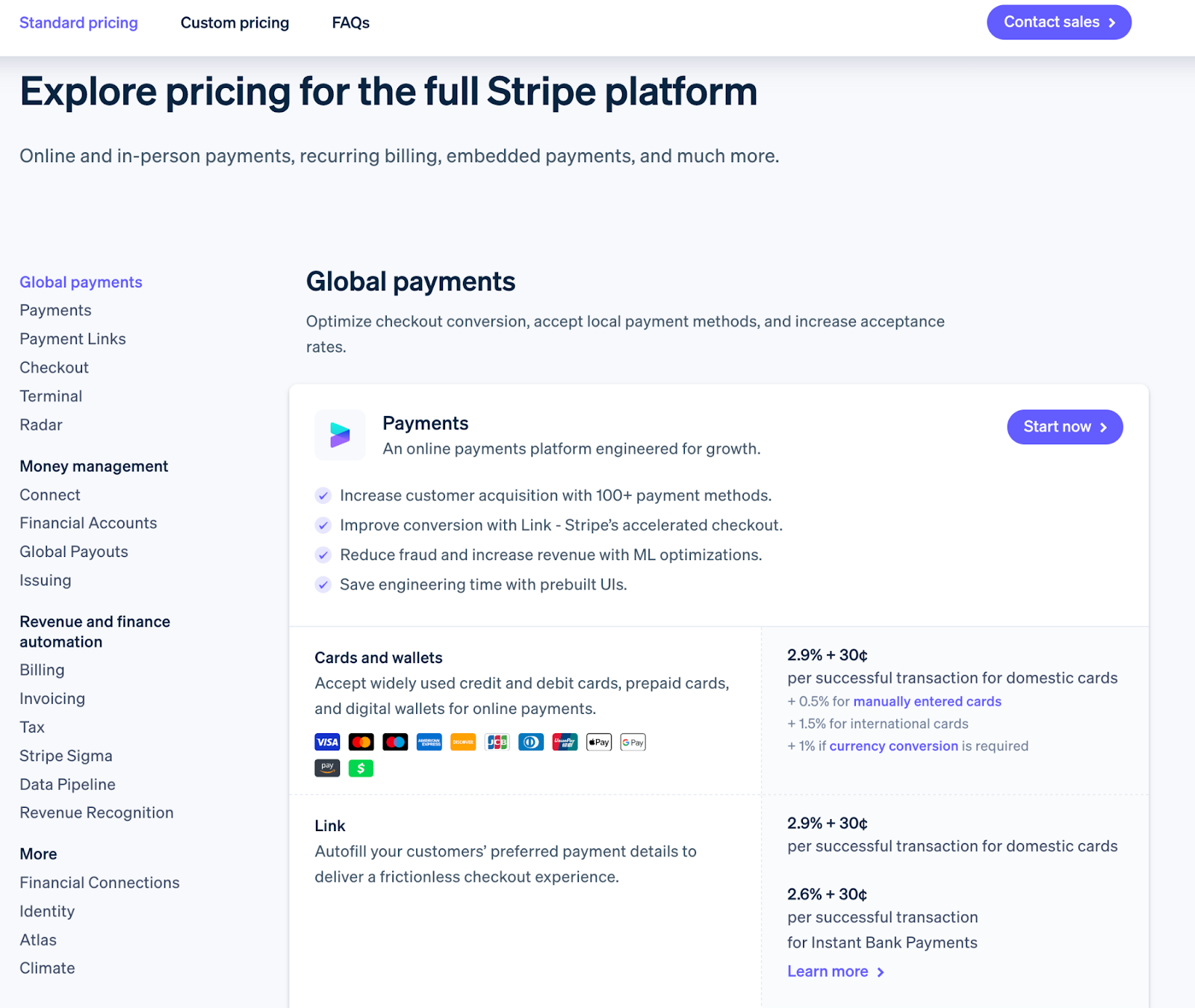
Stripe's pricing page leads with the core transaction fee upfront. No tiers, no plans. The number everyone came to find sits right at the top, no digging required.
The page runs deep, but the organization makes it work. Each product section follows the same structure: pricing, features, use cases, and integration details.
Everything you need to assess a product lives in one scroll, not scattered across multiple documentation pages. You can evaluate what you need without opening 10 tabs.
Each product section has its own independent pricing, which reflects a modular catalog architecture underneath. This is how you present a platform with dozens of products without overwhelming buyers. Show them what they came for, and let them explore the rest on their own terms.
What makes it work:
- Core pricing is visible immediately
- Consistent structure across all product sections
- Single-page depth replacing scattered documentation
For a full walkthrough on integrating Stripe with Stigg, check out our guide.
10. Datadog
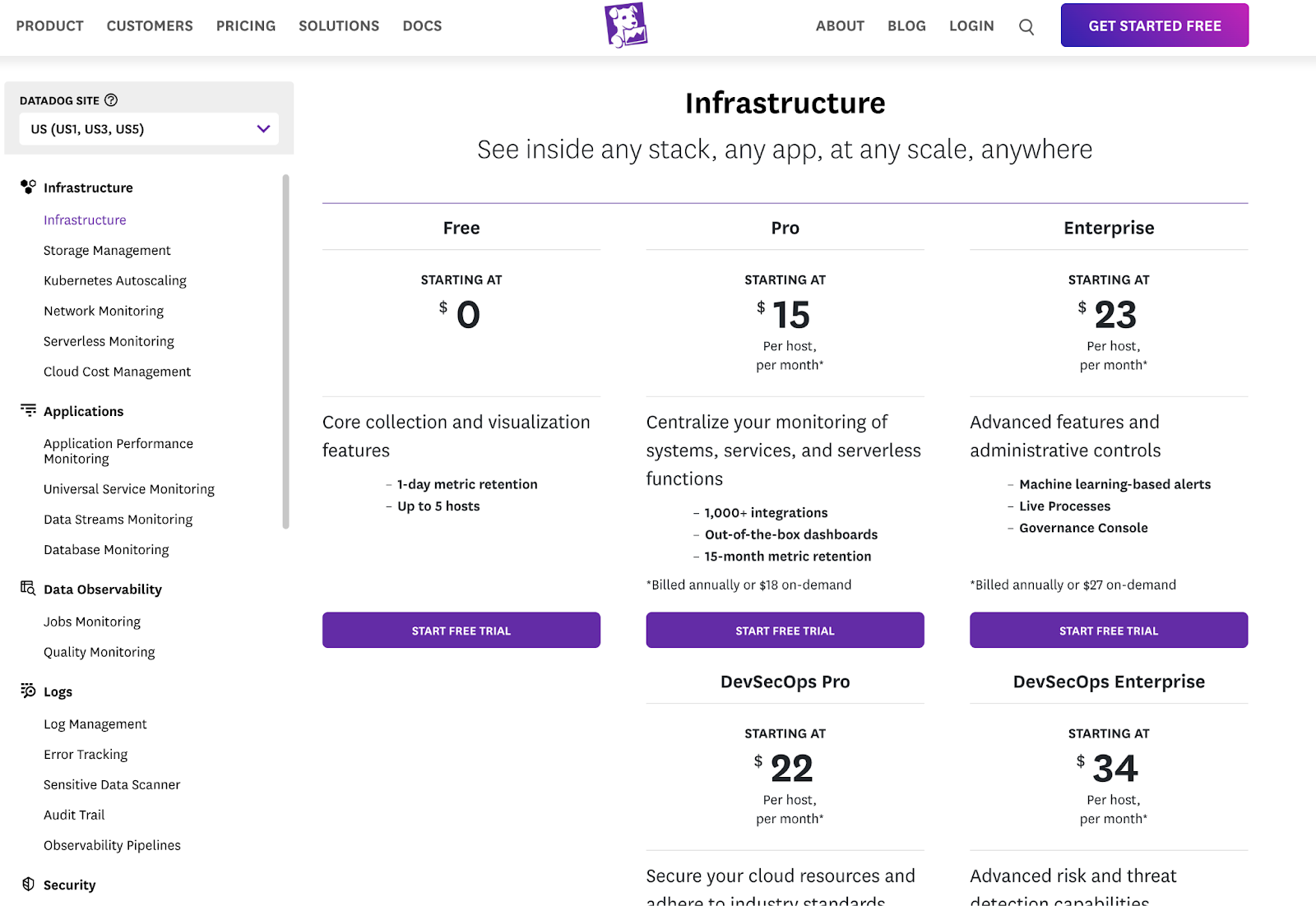
Datadog sells over 20 products across infrastructure, APM, logs, and security. A traditional pricing table would collapse under that weight.
A left-hand navigation lets you filter by product category, so you're not staring at a wall of options. Each product gets its own pricing view with relevant metrics: per host, per million events, per committer. You see what you're evaluating, not everything Datadog sells.
That navigation reflects a product catalog with 20+ independently metered products underneath. The FAQs cover billing mechanics like how the system counts committers and what different spans include. These are the details you’d expect to need a sales call for, but they're right there on the page.
What makes it work:
- Product filtering that tames catalog complexity
- Pricing units specific to each product’s value metric
- FAQs address real billing questions up front
11. Webflow
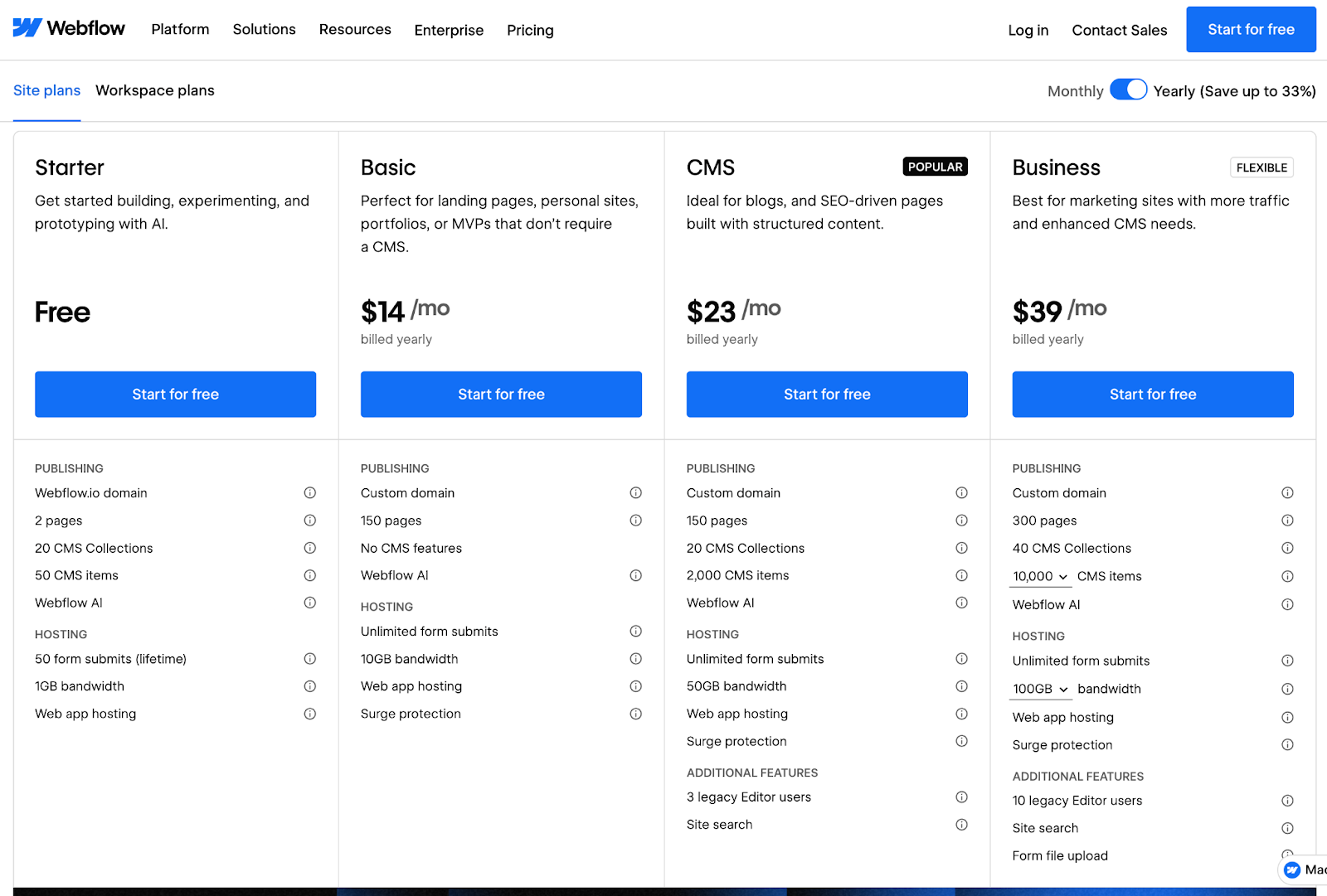
Webflow works with three pricing models on one page: Site Plans, Ecommerce Plans, and Workspace Plans. Each plan scales differently based on traffic, transactions, or team size.
Collapsible sections keep it from becoming a mess. Each pricing category expands when you need details and collapses when you don't. Add-ons and enterprise options get their own expandable blocks. You decide how deep you want to go, and the page stays clean regardless of your choice.
What makes it work:
- Collapsible sections managing three distinct pricing models
- Buyers control what they see based on what they're evaluating
- Complete information without the wall of text
12. Miro
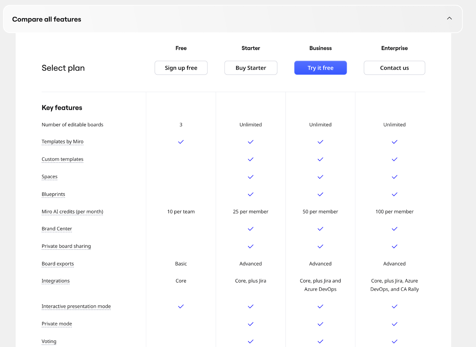
Long pricing pages can lose people fast. Miro’s pricing page runs deep, but the page organization keeps it scannable.
Four tiers sit at the top. Below that, a detailed feature comparison grouped by workflow: diagramming, collaboration, and admin controls. You find what matters to your team without wading through everything else.
The Business tier is where things get interesting. AI credits are adjustable from 350 to 2,500 per month, and the per-team price updates in real time as you move the slider. Dynamic pricing like this requires metering infrastructure underneath to track usage and adjust costs on the fly.
What makes it work:
- Workflow-based feature grouping for quick scanning
- AI credits contextualized with real-world output estimates
- Depth without sacrificing navigability
13. MongoDB Atlas
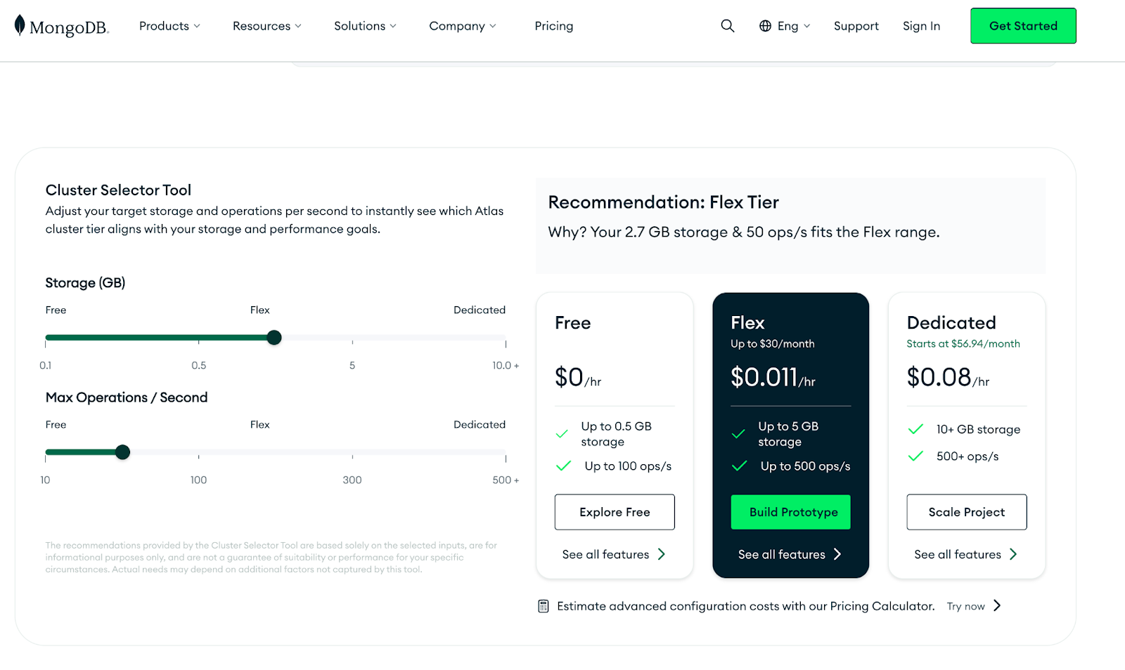
Cloud provider, region, cluster configuration, storage, operations per second. MongoDB Atlas pricing depends on all of it. A static pricing table can't capture that many variables.
A calculator does the heavy lifting instead. You select your requirements, and the page recommends a tier with real-time cost estimates. No guesswork, no waiting on a sales call to get a ballpark number.
Additional services like Atlas Search, Vector Search, and Stream Processing have their own pricing sections below. Each component can be assessed independently, so you're not trying to reverse-engineer a bundle to figure out what you actually need.
What makes it work:
- Calculator handles genuine infrastructure complexity
- Tier recommendations based on actual requirements
- Modular pricing for add-on services
14. Scribe
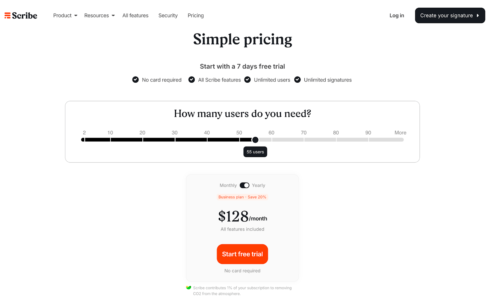
“We'll save you time.” Every tool says it. Scribe's pricing page actually shows you how much, down to the dollar.
Scribe automatically generates step-by-step guides from screen recordings. The pricing page opens with a slider asking, “How many users do you need?” Adjust the number and the Business Plan pricing updates instantly.
But the ROI calculator is the real standout. Time saved, guides created, dollar value recovered. Vague promises become concrete numbers. The CTA stays low-pressure throughout: “Start your free trial.” No hard sell, just an invitation to try it.
What makes it work:
- User slider matching pricing to actual team size
- ROI calculator quantifying value in hours and dollars
- Free trial CTA that invites rather than pushes
15. Slack
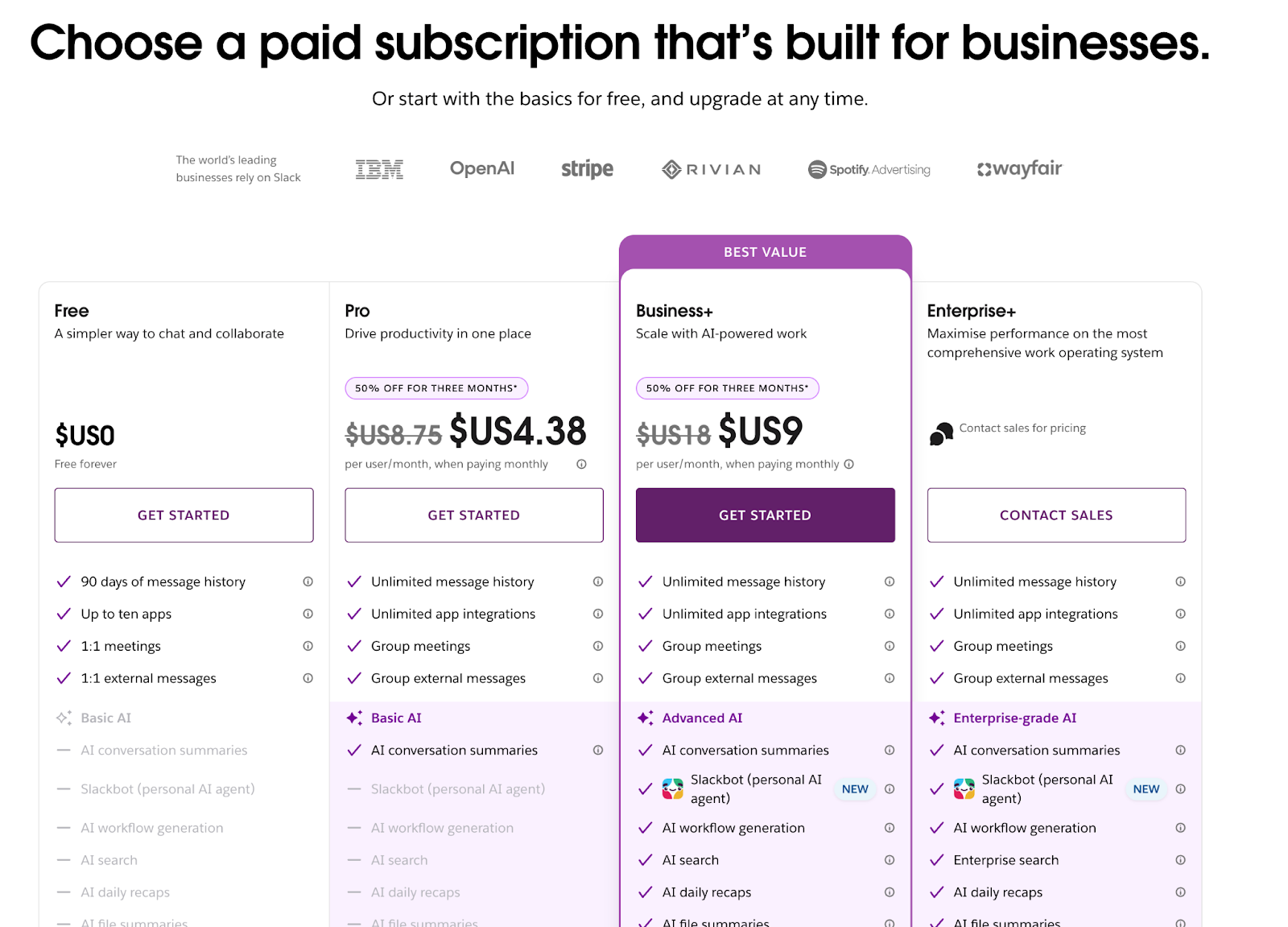
A 3-person startup and a 30,000-person enterprise need very different things. Slack's pricing page has to make sense for both.
The page leads with value, not price. Top features for each tier come first, so visitors understand what they're getting before the numbers enter the conversation. On mobile, expandable sections keep everything clean without sacrificing depth.
Both desktop and mobile versions feel equally polished, which matters more than most teams realize. Buying decisions happen across devices. Stakeholders share links, compare options on their phones, then revisit on laptops. A pricing page that breaks on mobile loses buyers mid-decision.
What makes it work:
- Value-first presentation that hooks visitors before showing price
- Responsive design that works well across all devices
- Expandable sections that manage information density smartly
16. HubSpot
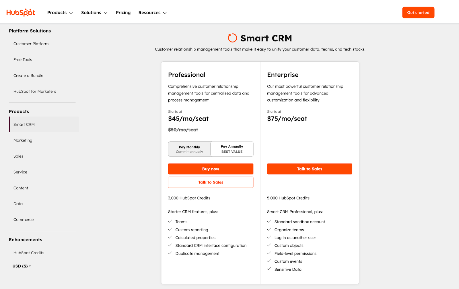
HubSpot sells a lot: marketing, sales, service, CMS, CRM, and more. Fitting all of that into one pricing page is tricky. Too much information and buyers leave. Too little and they can't make a decision.
HubSpot’s solution is a sidebar that acts like a table of contents. Customer Platform, Free Tools, Create a Bundle, and individual products. Click any of them, and you get a focused pricing view with relevant tiers and feature comparisons. No scrolling through products you don't care about.
Monthly/annual toggles give buyers even more control. Like Datadog, HubSpot treats the pricing page as a browsing experience rather than a wall of information.
What makes it work:
- Left-hand navigation separates a large product portfolio
- Product-specific pricing views with relevant comparisons
- Progressive disclosure lets buyers control the detail level
17. Framer
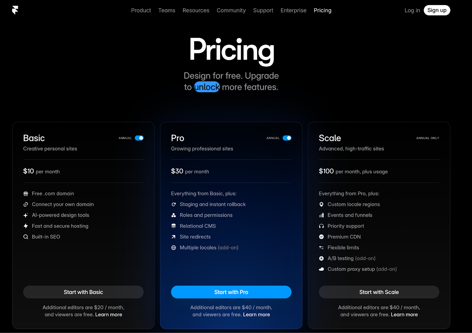
Per-seat costs, CMS items, bandwidth, form submissions. Framer's pricing page has a lot of variables to communicate.
Three tiers span Basic to Scale, with features organized into clear categories: core capabilities, usage limits, and collaboration tools. Standard stuff. What's smart is how Framer handles add-ons.
Localization and Site analytics sit in a separate section with independent pricing. Buyers can customize without upgrading to a tier they don't need. The FAQs cover practical questions like how extra editors are billed and how refunds work.
What makes it work:
- Usage limits are clearly displayed per tier
- Add-ons separated from core tier decisions
- FAQs address real billing mechanics
18. Jasper
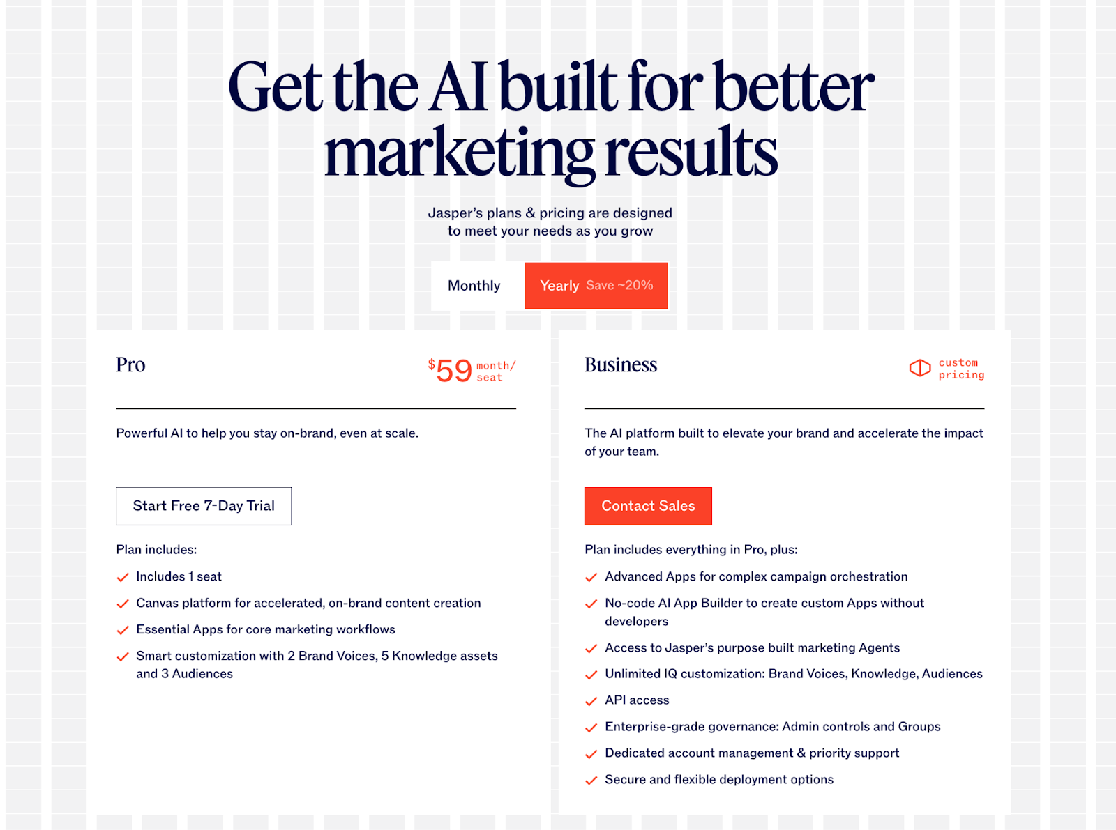
Different stakeholders care about different features. End users want to know what the platform does. Developers want API access. IT wants security. Jasper's pricing page is built around that reality.
Pro and Business plans sit as side-by-side columns. The feature comparison is organized by buyer role, so each stakeholder finds their section without wading through the rest.
The FAQs follow the same logic. Instead of one long list, it's segmented into Jasper Basics, Billing Questions, and Product Questions. You get to your answer faster.
What makes it work:
- Feature categories match different stakeholder concerns
- Security section addressing enterprise objections directly
- Segmented FAQs reduce friction for specific buyer questions
19. Loom
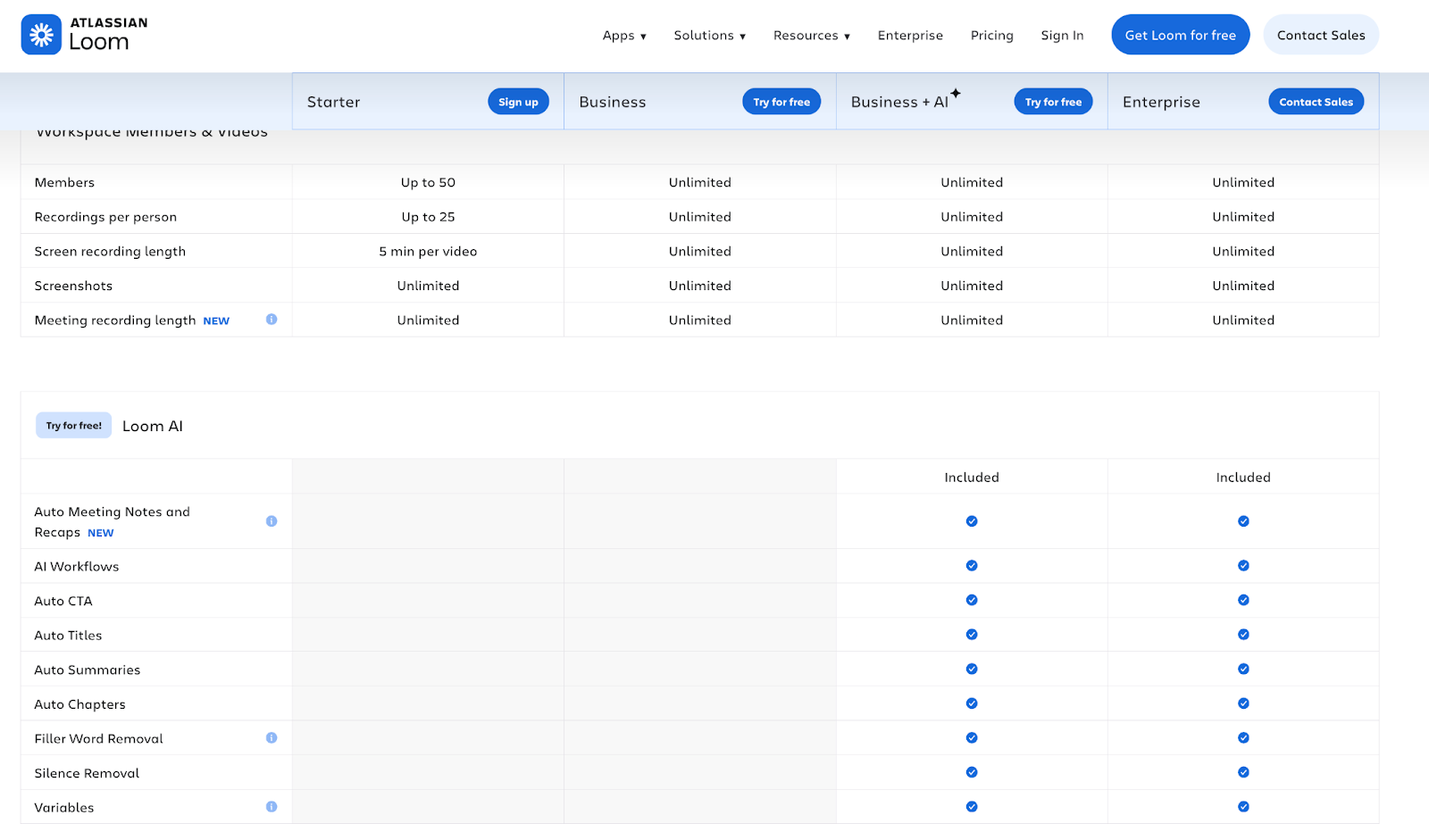
No tabs, no toggles. Loom puts all four tiers side by side: Starter, Business, Business + AI, and Enterprise. You see everything at once.
The comparison table runs deep, but sticky headers keep tier names visible as you scroll. You never lose track of what you're comparing, even at the bottom of a long feature list.
Blue callout boxes highlight AI features throughout, making the upgrade path obvious. Want AI? Here’s where you get it. The differentiator is clear without needing a sales deck to explain it.
What makes it work:
- Side-by-side tiers enabling immediate comparison
- AI features are clearly positioned as the upgrade hook
- Sticky headers maintain context through long feature lists
20. Cursor
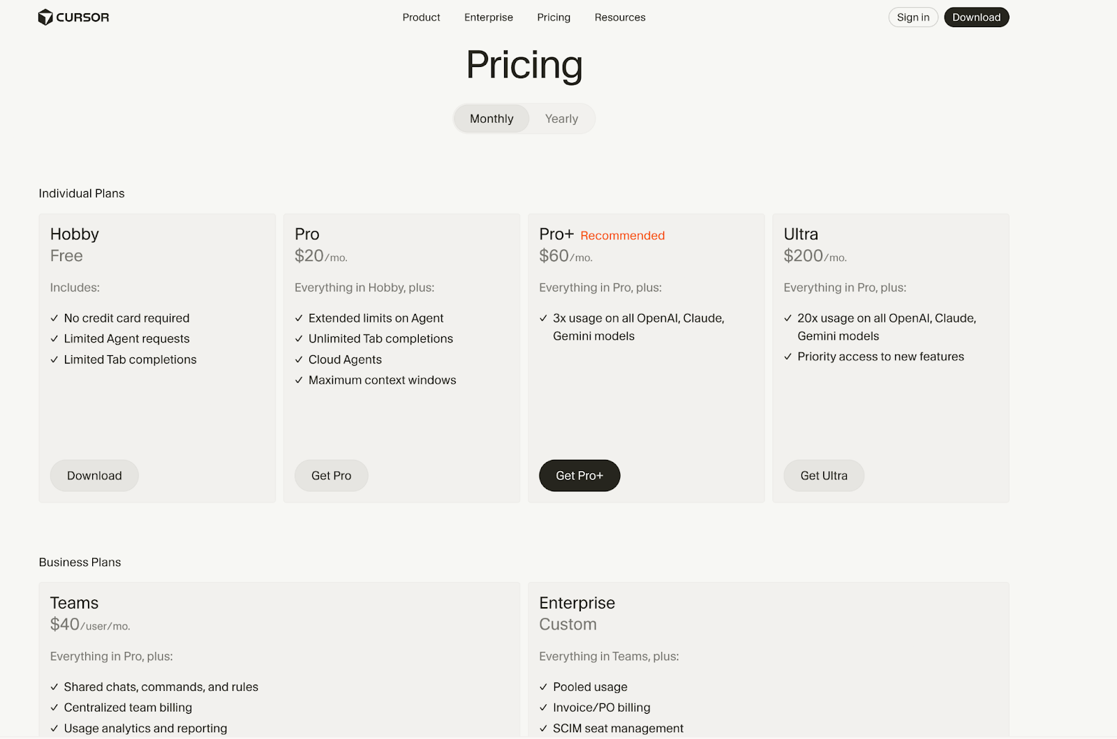
Cursor tracks usage across multiple AI models, enforces different limits per tier, and routes requests based on capacity. All in real time, all invisible to the user. The pricing page has to explain what that system does without exposing how complicated it is underneath.
The page separates Individual Plans from Business Plans at the top. Individuals see Hobby through Ultra tiers. Procurement teams see Teams and Enterprise. No scanning required.
Pro includes unlimited usage through “Auto” mode that routes to different models. The comparison tables show exact limits per tier, and the FAQs explain how usage is metered and when limits reset.
What makes it work:
- Clear separation between Individual and Business Plans
- Usage credit model explained with concrete numbers
- Model routing tied to plan tier and capacity
21. Notion
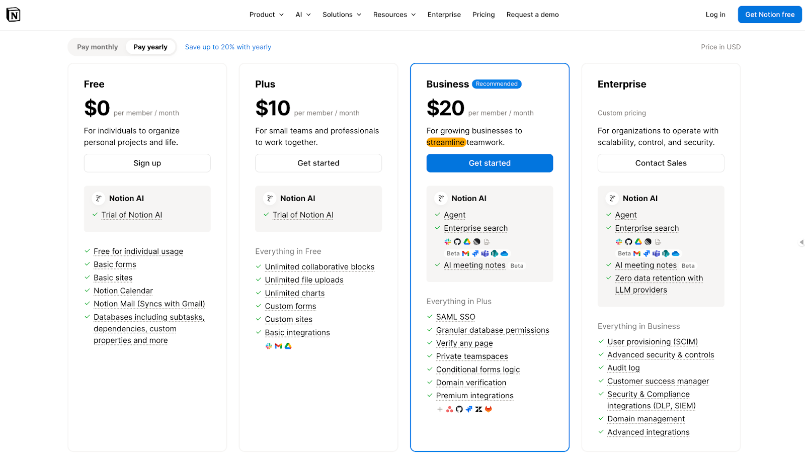
Notion's free tier is genuinely usable. That's the whole strategy.
Users build habits and dependencies before hitting any paywalls. When teams eventually need collaboration features, security controls, or admin tools, the upgrade path is already clear. No hard sell required, the product already made the case.
Four tiers span Free to Enterprise, with Business marked “Recommended” to guide undecided buyers. Logos from OpenAI, Figma, and other tech companies appear early, signaling that sophisticated teams have already made this choice.
What makes it work:
- Free tier that creates product dependency before monetization
- Social proof positioned to influence before pricing details
- Clear upgrade triggers as teams scale
22. Wispr Flow
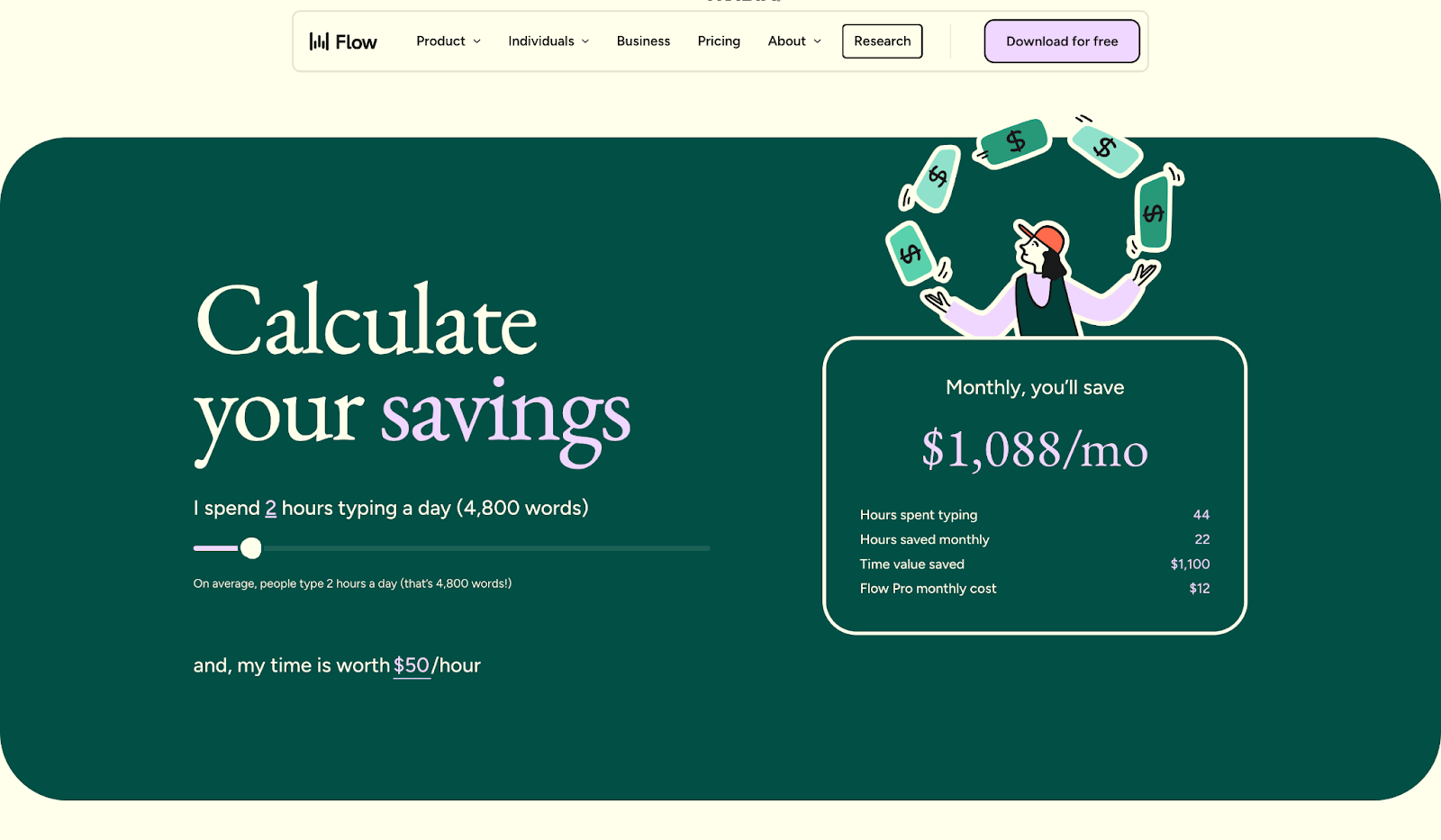
How much is your time worth? Wispr's pricing page answers that question literally.
A savings calculator sits below the 3-tier layout. Enter the hours you spend typing per day and your hourly rate, and the calculator shows your monthly savings in dollars. ROI becomes real before you've spent anything.
Wispr Flow is a voice-to-text tool for faster typing. The pricing page organizes the feature comparison by buyer type: device and platform support for individuals, team collaboration for managers, security and compliance for enterprise. You find your section and skip the rest.
What makes it work:
- Savings calculator showing real dollar impact
- Feature sections organized by buyer concern
- Clean layout that gets to the point fast
23. Zapier
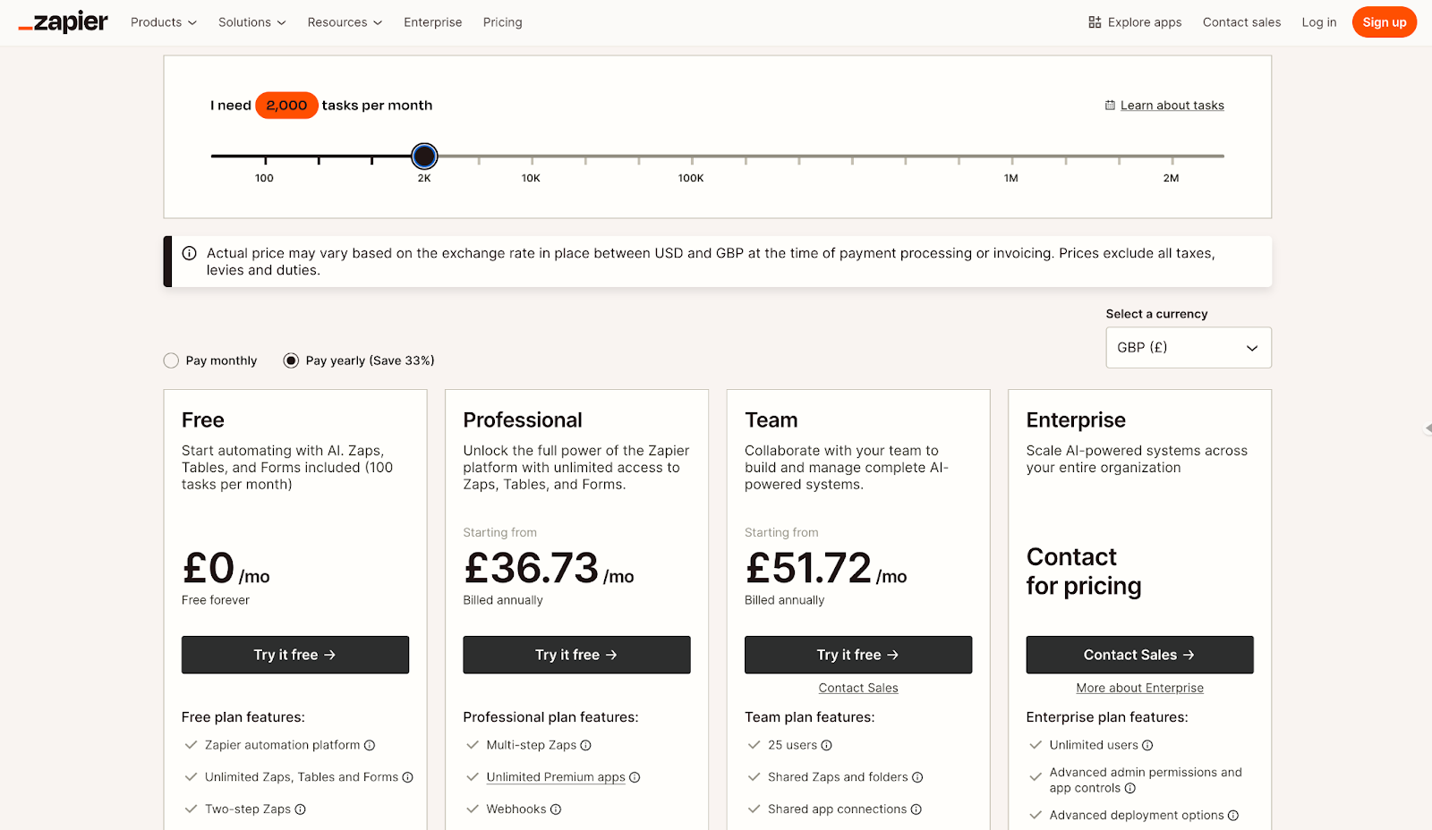
Most buyers have no idea how many tasks per month they actually need. Zapier's pricing page helps you figure that out before picking a plan.
An interactive slider opens the page. Adjust the number and pricing updates across all tiers instantly, so you're matching plans to real usage instead of guessing and hoping you got it right.
Four tiers span Free to Enterprise. Feature comparisons are organized into sections: Admin controls, Collaboration tools, Support, AI products, Zap features, and Tables and Forms. Detailed features expand only when you need them, keeping the page manageable despite the depth.
A “How it works together” visual at the bottom shows how Zapier's products connect. Buyers understand what they’re paying for, not just how much.
What makes it work:
- Task slider letting buyers match plans to actual usage
- Collapsible feature sections manage information density
- Visual explainer connecting pricing to product value
24. Basecamp
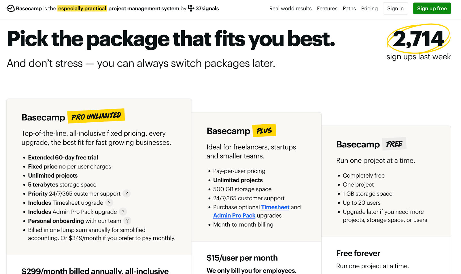
Basecamp's pricing page looks like a landing page that happens to have prices on it.
Instead of leading with tiers and feature grids, Basecamp leads with narrative: what's included in every package, why Basecamp is a company worth trusting, and how customers feel after switching. The pricing almost feels secondary to the pitch.
A live counter showing the exact number of “sign-ups last week” adds social proof without needing testimonials. This kind of dynamic content requires infrastructure that can update in real time, but the payoff is trust without the hard sell.
What makes it work:
- Narrative structure that sells before it compares
- Live sign-up counter as real-time social proof
- Promotional tone that informs rather than pressures
25. Typeform
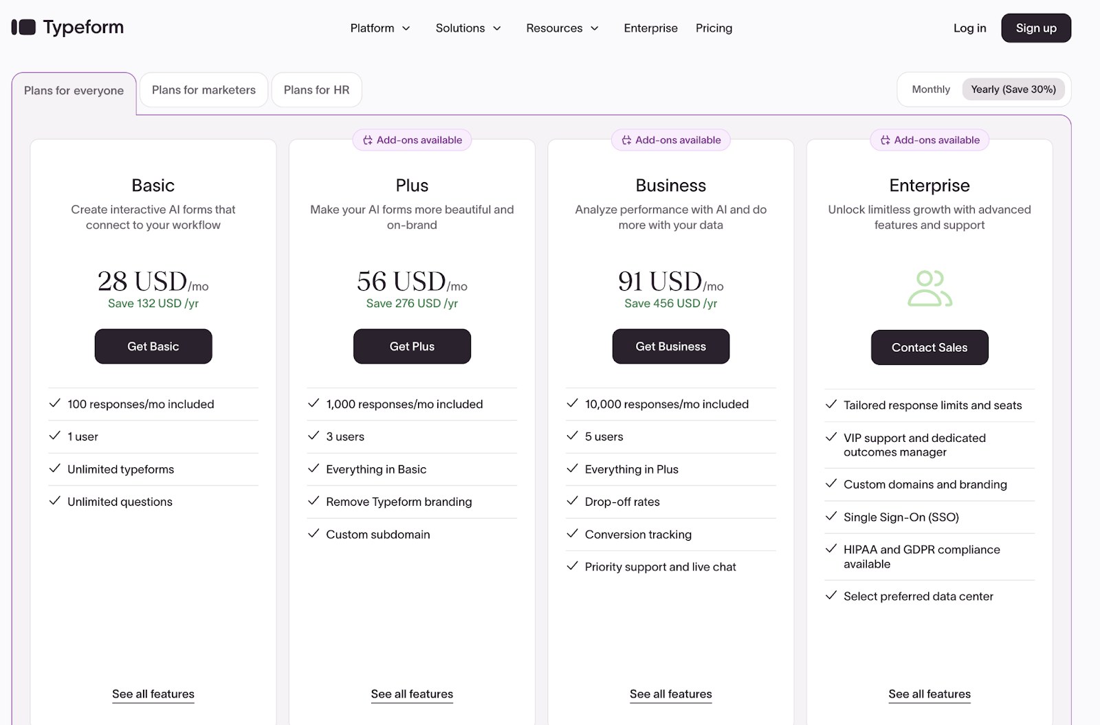
Dense pricing pages have a problem: buyers get lost before they get to the CTA. Typeform's page is long, four tiers with comparison tables covering responses, features, integrations, and support, but Typeform has built the navigation to match.
Sticky headers keep tier names visible as you scroll. A sticky footer appears at the bottom with CTAs for each plan. You can explore every detail without losing your place or hunting for the next step.
Mid-scroll, a testimonial banner shows up, “Trusted by 95% of the Fortune 500.” Most pages save social proof for the top or bottom. Typeform puts it right where attention starts to drift.
What makes it work:
- Sticky headers keeping tier context visible while scrolling
- Sticky footer CTAs appearing when buyers are ready to act
- Social proof positioned mid-page to reinforce credibility
Best practices for SaaS pricing pages
Now, let’s look at what the best pricing pages get right in more detail:
They help buyers compare without getting lost
Page organization determines whether users find answers in 10 seconds or give up. Sticky headers work best for long feature lists (20+ items), and tabs make sense when you have 2–4 distinct sections or plans to toggle between. Column layouts, collapsible sections, tabs. Different approaches, same goal. The best pages pick one approach and commit to it.
They make it obvious who each plan is for
Buyers should be able to self-select without reading every line item. Taglines, feature groupings, and personas like “For growing teams” or “Built for enterprise security” let buyers skip the fine print. If someone has to study the page to figure out which plan fits them, you've already lost momentum.
They let buyers estimate their actual cost
This matters most for usage-based and credit models. If the final price depends on how much someone uses, a static table isn't going to answer their questions. Give customers an interactive calculator or slider that updates in real time so they can see what they'll actually pay across different tiers.
They show usage limits up front
For AI and API products, displaying limits and credit balances up front prevents billing surprises. It also saves your support team from answering the same questions over and over.
They organize their FAQs
Organizing FAQs by category helps users find answers in seconds instead of scrolling through dozens of unrelated questions. Group questions into clear categories like “Billing,” “Technical Support,” “Account Management,” and “Getting Started.” Buyers scan category headings, click the relevant section, and get their answer without reading every question on the page.
They place trust signals intentionally
Strategic placement of trust signals converts more visitors than disorganized social proof scattered across the page. Position customer logos and testimonials above the fold (before pricing tables) to build credibility when buyers first arrive. Add specific ROI claims or case study snippets mid-page, right after pricing details, to reinforce trust when decision fatigue sets in.
What happens when your pricing needs to change?
Every SaaS pricing page example in this list will need an update at some point. A new tier, different limits, or an add-on that didn't exist last quarter. The question is whether that change takes an afternoon or becomes a project.
The companies that iterate fastest on pricing keep their pricing page connected to their product catalog. Update the source, and the page reflects it.
Stigg's pricing table widget works this way. Change a plan in your catalog, and your pricing page updates automatically.
If you're rethinking how your pricing page stays in sync with your stack, we're happy to walk you through it.
FAQs
1. What’s the most effective layout for a SaaS pricing page?
The most effective layout for a SaaS pricing page depends on your catalog complexity. Side-by-side tiers work best for three to four plans. Left-hand navigation suits large product portfolios like Datadog or HubSpot, while collapsible sections help when you have multiple pricing models like Webflow.
2. How many pricing tiers should I show?
Most SaaS pricing pages show three to four pricing tiers. This range balances upsell opportunities without overwhelming buyers. The sweet spot combines Free, Pro, and Enterprise, with a highlighted “Most Popular” option to guide undecided visitors. Fewer than three limits growth, but more than four creates hesitation.
3. Should I include a pricing calculator or slider?
Yes, you should include a pricing calculator or slider if your pricing depends on usage, seats, or configuration. Static tables can't answer “What will I actually pay?” for usage-based models. Sliders and calculators like those from ChartMogul, Scribe, and Zapier let buyers estimate costs based on their specific situation.
4. Where should I place social proof on a pricing page?
Place social proof early to build confidence before buyers dig into details, and mid-page to reinforce trust when attention drifts. Logos from recognizable companies work well near the top, while customer quotes with specific metrics perform better near CTAs.
5. How do I update my pricing page when plans change?
Updating your pricing page when plans change requires a system that automates the process. The fastest-iterating companies manage their product catalog in a system where everything updates automatically: in-app customer portals, billing, CPQ, and pricing pages.
With tools like Stigg, you update a plan once, and the changes reflect across your stack. No code changes required for new tiers, usage limits, or add-ons.
%20(1).png)
%20(1).png)
%20(1).png)
